Why a Converting Website Beats a Pretty One
Good-Looking Website, Zero Calls? Here's What's Actually Missing
A lot of tradies get their website built the same way they'd choose a ute — they want it to look good. Clean design, nice logo, a few photos of finished jobs, maybe some fancy animations when you scroll. It looks the part.
Then it sits there generating almost no work.
The problem isn't that it's ugly — often the opposite. It's that "looks professional" and "gets you booked jobs" are two completely different goals, and most trade websites are built for the first one while ignoring the second entirely.
What a Website Is Actually For
A homeowner searching "electrician near me" at 9pm isn't browsing for design inspiration. They've got a problem, they're comparing two or three options fast, and they're deciding in seconds whether to call you or move to the next result. Your website has one job in that moment: make it obvious what you do, where you do it, and how to get in touch — instantly.
Every other design choice is secondary to that.
What "Pretty But Doesn't Convert" Usually Looks Like
A homepage that opens with a big scenic photo and a slogan like "Building Your Dreams," with no phone number in sight
A phone number that's an image or plain text instead of a tap-to-call link — useless on mobile, which is where most searches happen
A contact form with ten fields before someone can even ask a question
Generic stock photos of a handshake or a toolbelt, instead of actual jobs you've done
A slow-loading homepage packed with animations, video backgrounds, or oversized images
Vague service descriptions ("Quality workmanship you can trust") instead of specific services and suburbs
None of this looks bad. It just doesn't do the one job the site actually needs to do.
What a Converting Website Actually Needs
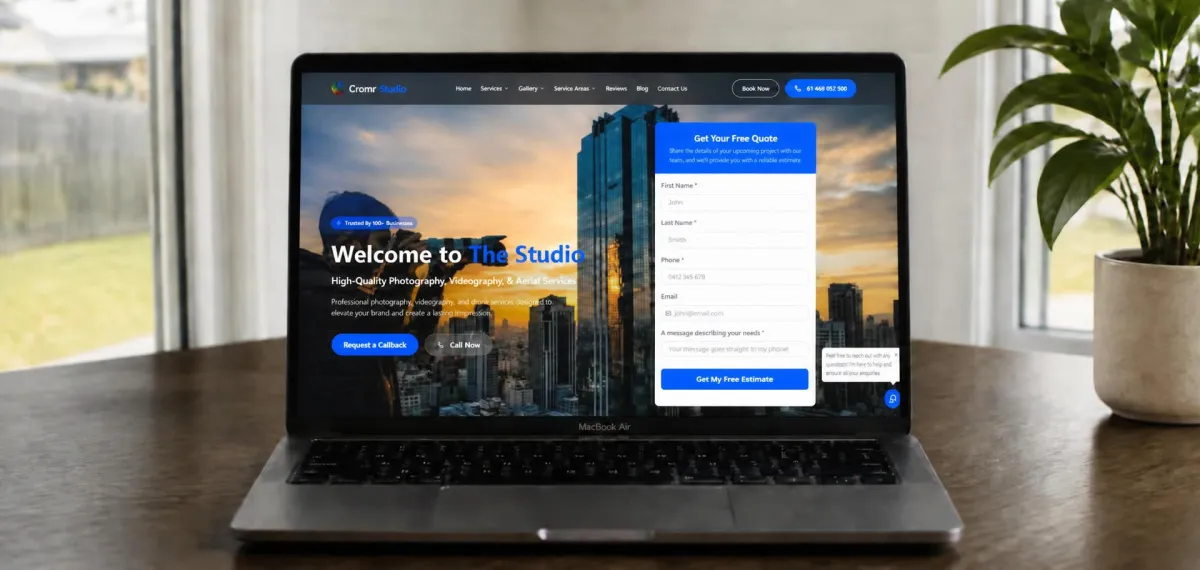
A visible call-to-action in the first three seconds. "Call Now" or "Get a Free Quote," in a button that's impossible to miss, above the fold — not buried after three paragraphs about your company history.
A phone number that's tappable, not just readable. On mobile, every extra step between "I need this" and "I called them" loses you a percentage of visitors.
Trust signals right up front. A star rating, a review count, "licensed and insured," and years in business, visible without scrolling. This does the same job in the first five seconds that a full page of reviews does over five minutes.
Real photos. Actual jobs, actual vans, actual you — not stock photography. People can tell the difference, even if they can't say why.
A short quote request form. Name, phone, suburb, what they need — four fields, not fifteen. Every extra field is a chance for someone to give up halfway.
Fast load speed, especially on mobile. A website that takes six seconds to load loses a huge share of visitors before they've even seen it — long before your design gets a chance to impress anyone.
A Quick Comparison
Picture two plumbers with websites live at the same time.
One has a beautifully designed site — full-screen video of a tap running, smooth animations, a proper "About Us" story. It takes five seconds to load on mobile, and the phone number is tucked away in the footer.
The other has a plain, fast-loading page: a clear "Call Now" button at the top, four Google reviews visible immediately, and a four-field quote form.
The first site gets compliments. The second one gets phone calls. Visitors don't wait around to appreciate good design — they act on what's immediately obvious, or they leave.
Common Mistakes to Avoid
Prioritising design trends over speed. Parallax scrolling and video backgrounds look impressive in a portfolio, but they slow down the one thing that actually matters: how fast someone can act.
Writing for yourself instead of the customer. A paragraph about your company values matters far less than answering "do you cover my suburb" and "how fast can you come out."
Copying a generic template everyone else uses. If your site looks identical to five competitors', the only thing left to compare on is price — which is the last competition you want to be in.
Where to Start
You don't need a full rebuild to see a difference. Start with three quick checks on your current site: is your phone number tap-to-call, is a clear call-to-action visible without scrolling, and does the homepage load in under three seconds on mobile? Fix those three things before touching anything else — they matter more than any redesign will.
A website doesn't need to win design awards. It needs to make it effortless for someone who's already decided they need a tradie to end up calling you instead of the next name on the list.
Want a Website That Actually Gets You Calls?
Growth Systems Co builds conversion-focused websites for trade and home service businesses across Australia — fast, mobile-ready, and set up to turn visitors into booked jobs from day one.